End-to-end product design for a consumer reading platform.
The full product design loop - user flows, wireframes, prototypes, and FSD documentation - for a B2C comic platform inside NHN Vietnam. A counterweight to the enterprise work: shorter cycles, sharper consumer feedback, the same systems instinct underneath.
FIG.01 · Product design loop - research → ship → instrument
DM-CP / 001
NHN Vietnam's comic platform was a B2C reading product - millions of weekly chapters served, a long tail of content, a tight team. My remit covered the full loop: research, user flows, wireframes, hi-fidelity prototypes, and the FSD (Functional Specification Document) handed to development.
What made the work fast was that the developers were in the same room. The FSD wasn't a contract over a wall - it was a written form of the conversation we had already had together. Every screen shipped twice as fast because every screen was already half-agreed.
The product instinct underneath this work is the same one that shows up in enterprise: structure first, surface second. A reading product seems simple until you remember it has a discovery problem, a habit problem, and a monetisation problem stacked on top of each other.
02 / Flows
The core consumer loop, in four steps.
The product's central loop - discover, sample, read, return - was the spine the whole UX hung from. Optimising that loop (rather than any single screen) was what moved the metrics that mattered.
STEP 01
Discover - browse curated and algorithmic shelves.
STEP 02
Sample - first three chapters free, frictionless.
STEP 03
Read - vertical reader with progressive load.
STEP 04
Return - library + notifications + daily passes.
Wireframe approximations of the core loop · see production UI below
03 / Final UI
Production screens - the consumer loop on the surface.
Seven screens covering discovery, sampling, reading, and return. The same shelves, the same access logic, the same reader contract - now in production UI. Coral accent, soft shadow surfaces, restrained typography to let the artwork lead.
6 screens
iOS · 9:19.5 · light theme
The UI is deliberately quiet. Comic covers are loud - saturated, illustrative, full of motion - so the chrome around them does as little as possible. A single coral accent (used for the primary CTA, the active tab underline, and the floating home pill) is the only colour the system contributes. Everything else is neutral, so the artwork can lead.
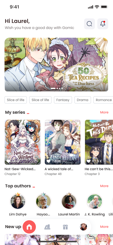
- Greeting + intent on the home screen. "Hi Laurel" personalises the surface in one line; the search and notification glyphs sit at the right edge - high-frequency, not high-prominence. The hero banner is the day's editorial pick, not an ad slot.
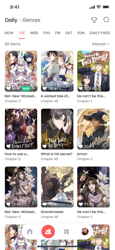
- Genre chips as a horizontal filter rail. Slice of life · Fantasy · Drama · Romance - a soft filter the user can apply without leaving home. Chips scroll horizontally, never wrap, so the visual rhythm of the page stays predictable.
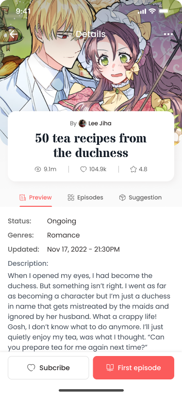
- Series Detail as a three-tab object. Preview, Episodes, and Suggestion are tabs on the same record - not separate routes. The hero artwork persists; only the lower panel swaps. This makes "sample → commit → discover related" a single screen, not a flow.
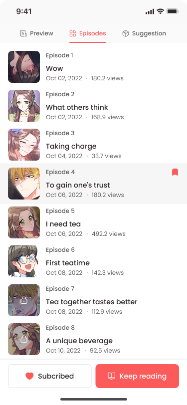
- Locked chapters surface their state inline. In the episodes list, locked items keep their thumbnail and metadata but show a lock glyph in place of the cover - never a paywall modal mid-list. The paywall only appears when the user actively taps into a locked chapter.
- Reader chrome that gets out of the way. Top bar collapses on scroll; bottom bar carries like, comments, and chapter pagination - the only persistent controls. The page itself is vertical, progressive, and full-bleed.
- Bottom nav with a centre pill. Home, Daily, Gift, and Profile are the four tabs; the centre is a coral floating pill that anchors the current section. The pill expands on the Profile screen to show the user's avatar - a small but legible state change.
A reading product is, structurally, four screens and a loop. The craft is in how lightly the chrome carries the user from one to the next - and how reliably it stays out of the way when the artwork is the thing.
04 / Documentation
FSD - the contract between design and build.
Every feature shipped with a Functional Specification Document - a written contract covering scenarios, states, edge cases, and acceptance criteria. The FSD is what turned design intent into something developers could implement and QA could verify.
FSD-042 · Vertical Reader - Progressive Load
01 / Purpose
Define the behaviour of the vertical comic reader when a chapter is opened, scrolled, completed, and exited. Covers both online and degraded-network conditions.
02 / Field definitions
chapter.idUUID · references content store
chapter.pages[]Ordered list, each page lazy-loaded
reader.positionFloat · % of chapter scrolled (persisted)
reader.stateidle | loading | reading | complete | error
access.tokenPer-chapter, expiring · checked on each fetch
03 / Scenarios
- S-01 · Cold open. User taps a chapter from a list. Reader opens, fetches metadata, then page 1 + 2 in parallel; pages 3-5 prefetched on first scroll.
- S-02 · Resume. Returning user is restored to
reader.position, with a soft 200ms scroll animation to land them in place. - S-03 · Network degradation. If a page fetch fails twice, reader falls back to a low-res placeholder + retry chip - never an error screen mid-chapter.
- S-04 · Completion. When
reader.position ≥ 0.95for ≥ 2s, chapter is marked complete and "next chapter" CTA replaces the bottom nav. - S-05 · Locked chapter. If
access.tokenrejects, reader transitions to a paywall surface that preserves the last unlocked panel as backdrop.
04 / Acceptance criteria
- Time-to-first-panel ≤ 1.4s on 4G median.
- Resume restores within 100ms of reader opening.
- No mid-chapter blocking error states under any tested network profile.
- Telemetry: open, scroll-25, scroll-50, scroll-95, complete, exit all fire exactly once per session.
05 / Out of scope
Comments, panel-level zoom, and offline download - covered by FSD-043, FSD-051, and FSD-061 respectively.
Consumer work has a different feedback loop than enterprise. The users are real, plural, and impatient; the metrics are fast; the decisions you got wrong show up by Wednesday morning.
Three things from this period quietly shaped how I now do enterprise architecture:
- Specs are the design.An FSD is not "the part after the design" - it is where the design becomes operable. Enterprise work taught me to start writing them earlier.
- State is the story.Consumer flows live or die by edge cases - empty, loading, error, locked, expired. The same is true at enterprise scale; the only difference is how many edges there are.
- Velocity is a system.Shipping fast wasn't about working faster - it was about reducing the surface area of every decision until the next one took no time.